Norway reveals final design of new series
 One of the most eagerly awaited new series is one step closer to being issued to the public. The Norges Bank has announced the final design and issuing dates of the new Norwegian banknote series.
The theme of the new series is the Sea. When the winning concept was announced it created quite a stir among collectors and in the world of banknotes. The design showed a traditional image on the front which had a connection with the sea (a boat, a lighthouse, a wave, etc.). But it was the back of the notes that proved to be the pièce de résistance.
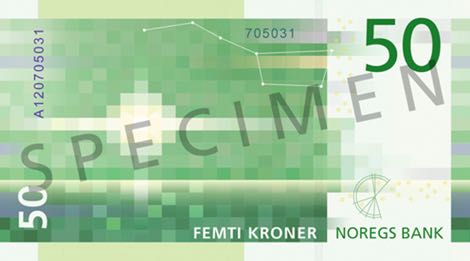
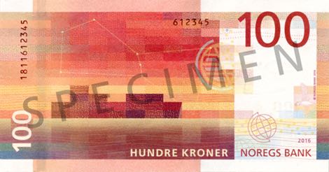
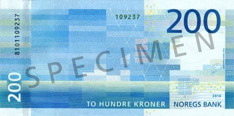
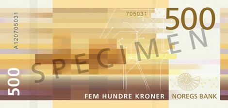
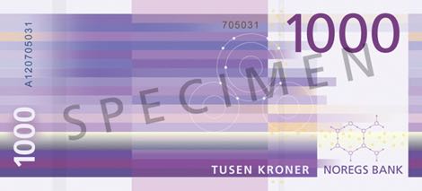
The back of the notes shows a pixelated image connected with the image on the front which gives it an ultra-modern and very original design. Mixed reactions were heard everywhere and I am myself still on the fence if I like it or not. But it sure created a discussion and interest which is always good in my opinion.
Some information on the new notes:
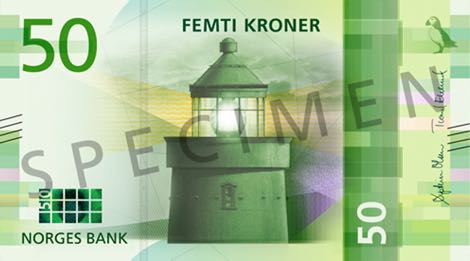
- 50-krone, green, 70x126 mm, front: Utvær Lighthouse in Solund, back: lighthouse beacon, will be issued in Q3-2018
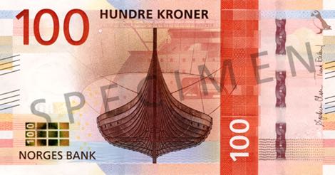
- 100-krone, orange-red, 70x133 mm, front: Gokstad ship, back: cargo ship, will be issued 30 May 2017
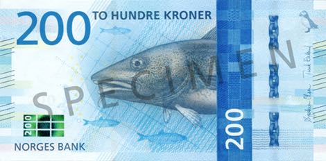
- 200-krone, blue, 70x140 mm, front: cod, back: fishing boat, will be issued 30 May 2017
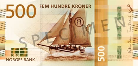
- 500-krone, yellow-brown, 70x147 mm, front: rescue vessel RS 14 "Stavanger", back: oil platform, will be issued Q3-2018
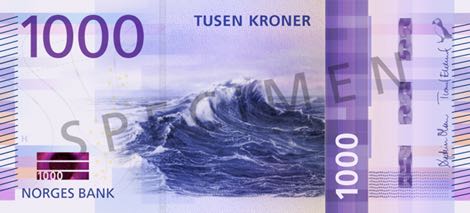
- 1,000-krone, purple, 70x154 mm, front: wave at open sea, back: open sea and horizon, will be issued Q4-2019
It seems that the signal flags from earlier designs have been removed from the final design. The signal flags spelled out N-O-R-G-E together which I thought was a nice detail. The site of the Norges Bank has some nice films if you're interested in the whole design process.


Geen reacties